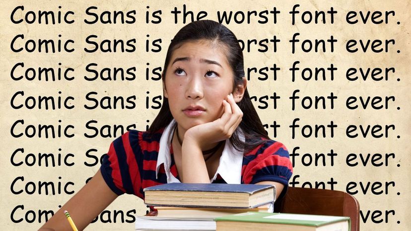
Oh wow, do some people ever hate Comic Sans. The font, popularized by your aunt and her friends and anybody who wants to give you explicit instructions about what you can and cannot throw into this particular toilet, is, in some people's opinion, an utter abomination. Seeing the typeface used in an inter-office email or on a T-shirt for a 5K race makes these people actually weak with a mixture of fury and melancholy. In fact, there are whole organizations devoted to abolishing Comic Sans forever on the grounds that there's no place in this world for a typographical "voice" that sucks in this particular way (that they're largely unable to describe). They might call it infantile, cartoony, trite or tacky or even submit that Comic Sans is to fonts what Nickelback is to bands. There are memes about all this — you can Google it.
But here's the thing about Comic Sans: You might hate everything it stands for, but it's actually exceptionally easy to read. Originally designed in the early 1990s by Microsoft engineer Vincent Connare for the little pop-up information bubbles that appeared in early versions of Microsoft programs like Word, the font was the product of his years in art school, Connare told CNN's Great Big Story, where he developed the opinion that subtlety had no place in an art museum:
Advertisement
"If you didn't notice it, I considered that was bad," said Connare. "And if you did notice that was good because at least they made you stop and look.”
When tasked with developing a new font for Microsoft, he figured the same principle would apply, and used the not-so-subtle lettering from classic comic books like "Batman" as inspiration for his now-infamous typeface.
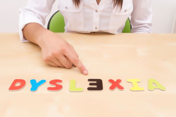
Although Comic Sans might not establish an appropriate tone for everything you want to communicate — a court summons, or the poster for a death metal show, for instance — it is actually one of the few widely available fonts that some people with dyslexia say makes it easier to read and write. And in a recent piece in The Establishment, writer Lauren Hudgins argues that railing against Comic Sans is actually a privileged, ableist perspective that ignores the needs of those with dyslexia.
Dyslexia is a condition in which a person with an otherwise average or high IQ has a tough time reading and writing due to their brain's inability to interpret words and letters. So when a dyslexic reader scans a line of text, their brain might initially process a word like "modern" as "modem," or "tip" might become "pit."
Comic Sans isn't the only font dyslexic readers claim help them manage their disability; some companies like Dyslexie and OpenDyslexic claim to make dyslexic-friendly fonts, created with specific input from dyslexic readers in mind. For instance, many report having trouble reading fonts that have those little lines at the end of each character called serifs, or fonts in which the letters that are mirror images of each other — p and q, b and d — look exactly the same when you invert them, or where the capital letter I, the lowercase l and the numeral 1 all look the same.
But scientific research into whether these special fonts actually work is pretty much nonexistent, although one 2013 study found familiar fonts like Arial, Verdana and Helvetica were often preferred by the study's dyslexic participants over dyslexic-friendly typefaces. According to co-author Dr. Ricardo Baeza-Yates — who when he conducted the study was a vice president of research at Yahoo! Labs in Barcelona, Spain — the specific elements of a font might not help with readability so much as an individual being accustomed to that particular font.
"We didn't include Comic Sans in our experiment, so I don't know if it's good for dyslexic readers," he says. "However, we showed that well-known fonts are good for people with dyslexia, and those should be the ones to use."
In other words, if a dyslexic reader is finding a serif-laden paragraph of Times New Roman looks like an impenetrable thicket of tiny lines and loops, then converting it into Comic Sans will probably help them decrypt it, if that's the font they've become habituated to reading and writing in.
But not everyone is convinced typography makes much of a difference for dyslexic readers. In fact, some think the background or text color is more important. Others, like Marco Zorzi, a professor in the department of general psychology at the University of Padova in Padua, Italy, think it has more to do with the spacing between letters. In a 2012 study, Zorzi and his co-authors found the effect of font to be small or nonexistent, and that the spacing between letters had a much larger and more reliable effect on readability for study participants.
"Fonts can slightly differ in the degree to which letters are spaced in a word, so this might affect legibility in dyslexics," says Zorzi. "But with digital devices these days, letter spacing can be easily increased for any font, so there is no need for special fonts."
Perhaps like other things people passionately adore or abhor — mustard, for instance, or Tyler Perry movies — we can be content to let Comic Sans be terrible for some people, but harmless if they don't engage with it, and of some significant use for others.
Advertisement

